 Suppose you have created a very good banner design. However, the font that you have used is not legible. Will people know what the banner is all about? They may praise the design but will they admire the complete project? According to the professional designers working at https://digitalpolo.com, graphic designing is not all about creating an outstanding image or graphic. The font also plays an important part in creating a successful design.
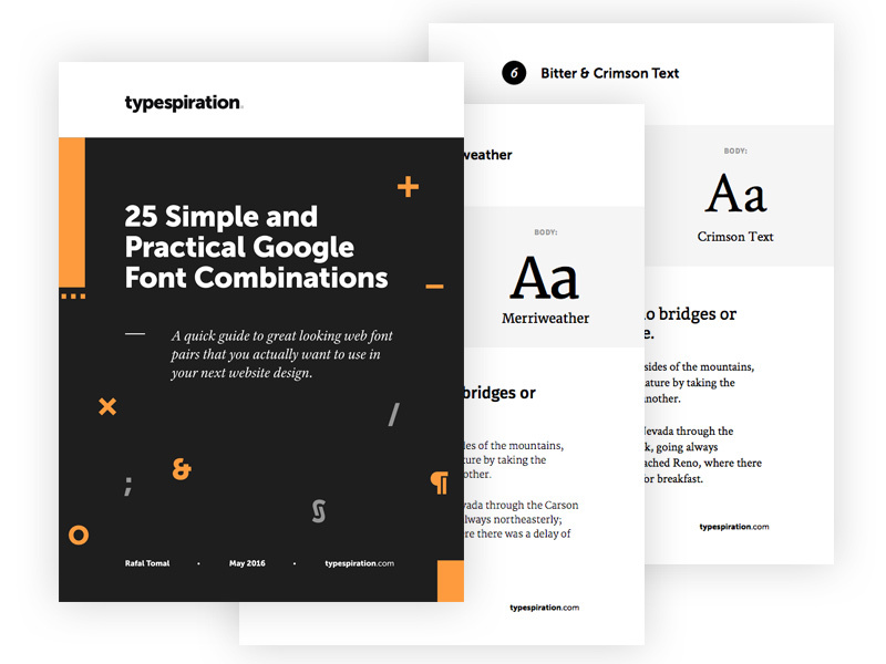
So, let us take a look at some of the Google font combinations for creative design ideas.
Oswald and Montserrat:
Oswald is a Sans-serif font that has a narrow appearance. The spacing in the letters makes the font look much leaner. You can pair it up with the urban typography Montserrat. Montserrat is also one of the Sans-serif fonts. But the letter spacing in this case is more than what Oswald has. You can use Montserrat in the heading of a design and Oswald in the body of the text.
Lato and Abril Fatface
If you ask me what my favorite way to combine fonts is, I would say that I love combining Serif fonts with Sans-serif fonts. According to many professional graphic designers, the traditional fonts are good for headlines because the Serif font makes it easier to understand what is written. On the other hand, the Sans-serif font such as Lato makes good typography for the body of the text. This is a combination that goes well with banner designs and brochure designs.
Open Sans and Raleway:
Sometimes you do not have to look for complicated fonts to stand out. You can pair up simple fonts and yet get an outstanding result. By outstanding result I mean you can engage your target audience without investing much time to search for the perfect typography.
If you take a look at the Open sans font, you will see that the font has a very friendly approach. As you can already guess from the name, the font is a Sans-serif font. It is a simple font that looks good even in printed form just like digital form. You can pair it up with another San-serif font Raleway. Raleway is an ideal font that is designed for larger texts. Hence, this is good for headings. When you combine both of these Sans-serif fonts, you get a graphic designing that has a friendly approach.
Cabin and Sniglet:
Do you want to create a design that appears to be funny and yet you want to maintain a hint of seriousness? Well, combine the fonts like Cabin and Sniglet and you are good to go. While both the fonts have a rounded appearance, there is a difference between the fonts.
The rounded Cabin font is good for the body of the text. It is good for brochure design and website design. Sniglet complements the design when you use the font in heading. Sniglet has more rounded edges.
Conclusion:
Choosing the fonts for your digital or print design is not as difficult as it seems. You do not even have to invest in buying typography. You can use the Google fonts and combine them depending on the graphic designing you are going for.
