 When you own a business and you want to make sure that your clients connect with you, you need to create brochures. Brochures are one of the marketing tools that are often used to tell people about your products, product launches, and other things that are in the interest of your target audience.
The first thing that anyone will notice in your brochure is the brochure cover design. Even though there are many marketing brochure templates available in the internet, I would suggest you to avoid those templates and create something of your own. Here I have discussed some color combinations that you can use for the cover design of your company brochure.
White and blue:
I would agree that it is an eternal color combination. Yes, the color combination has been used many a time in many types of graphic designing. However, it is still one of my favorite combinations. I will explain you why.
The first reason is that blue is a color that always invokes positive reaction. The color is associated with trustworthiness, loyalty, calmness, depth, etc. White, on the other hand, is a color that is associated with peace and serenity. So, when you combine both the colors, you are actually giving an impression that you are a reliable company. And that is what I like about this combination.
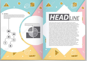
Pink and yellow:
A vibrant and positive color combination that you can try out is using pink and yellow. You can use different shades of pink and yellow to create the balanced brochure cover design. Both pink and yellow are colors that invoke many positive emotions within us. While pink stands for affection and love, yellow makes us happy. When you use these two colors in your brochure cover design, you instantly establish your company as lovable and the one that makes people happy.
Blue and red:
As I mentioned before, blue has a tranquil feel in it. Blue is a color that is associated with calmness. On the contrary, red is a color that is associated with fierceness. It is often used when you want to establish your company as a powerful entity.
If you take a look at company brochure examples, you would see that blue and red are not one of the most common choices. I agree that designing your brochure cover with these two colors can be challenging. But if you can do it properly, it is a killer combination.
Purple and orange:
Purple is a color that represents extravagance. It used to be one of the costliest colors in the past. Hence, purple is often associated with royalty and richness. On the other hand, orange is a chirpy color. It is very vibrant and it is related to encouragement. When you combine both the colors in your brochure cover design, your company is represented as a brand that has royal presence but also welcomes you warmly.
If you still need brochure design inspiration, you can always visit the graphic design company digitalpolo. You will find a lot of different types of brochure design here.
